
Adoption is the real output
A library has value only when teams can find, trust, and use it.
MetLife
I helped build and maintain MetLife’s global design system for teams across more than 50 markets. My work covered reusable components, visual standards, documentation, and reviews with developers and QA, translating design guidance into things teams could use.
Shared components and guidance gave teams a consistent starting point across products, platforms, and markets.
After the team’s work with R/GA on the rebrand, I helped translate the recommendations into reusable components and practical guidance on Design.metlife.com.
A brief overview
I reviewed responsive components with developers and QA, checking the implementation against the rebrand’s standards. Those conversations connected design intent to the behavior and details people would actually use.
I documented component features, variations, and live HTML demos. Teams could inspect how a component worked and when to use it, rather than reconstruct intent from a static mockup. Documentation and handoff were part of the product.
First look
Expand details
I refined guidance for logos, typography, color, illustration, icons, and photography within the shared system. These standards gave product teams a common starting point while they worked on different platforms and market needs.
I helped align the icon library with the system’s visual standards. Consistent iconography made the foundation easier to reuse across products, rather than leaving teams to invent different symbols for the same idea.
A library has value only when teams can find, trust, and use it.
Clear guidance can prevent as much downstream rework as the component itself.
A global baseline should create coherence while allowing for platform and market differences.
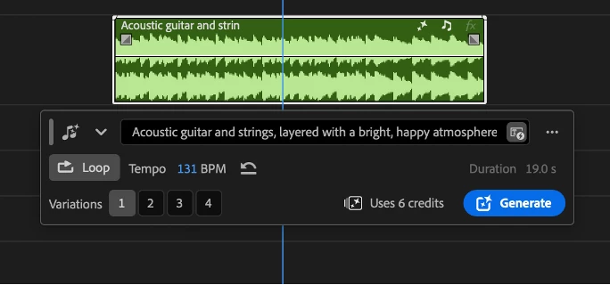
Adobe · Generative AI
Create music that fits your scene with clear, editable generation controls.
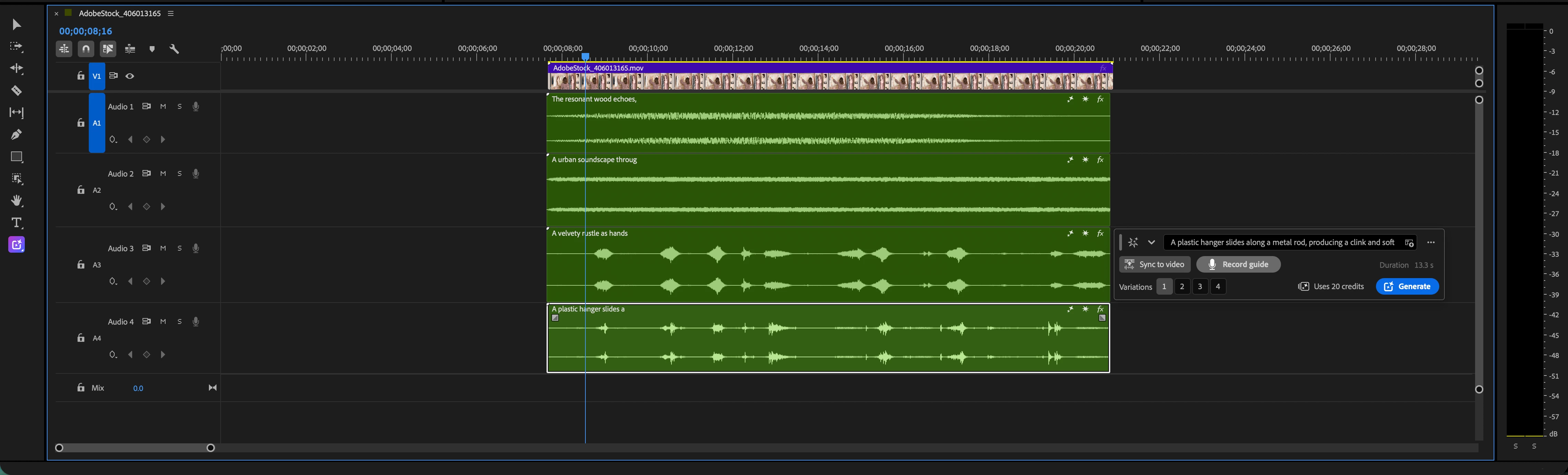
Adobe · Generative AI
Turn visible action into editable layers of ambience and sound effects.

Zipcar
Help members report delays and recover when their car is late.
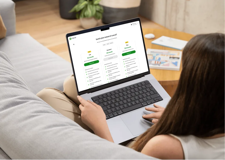
Zipcar
Introduce Zipcar’s first tiers for occasional and frequent drivers.
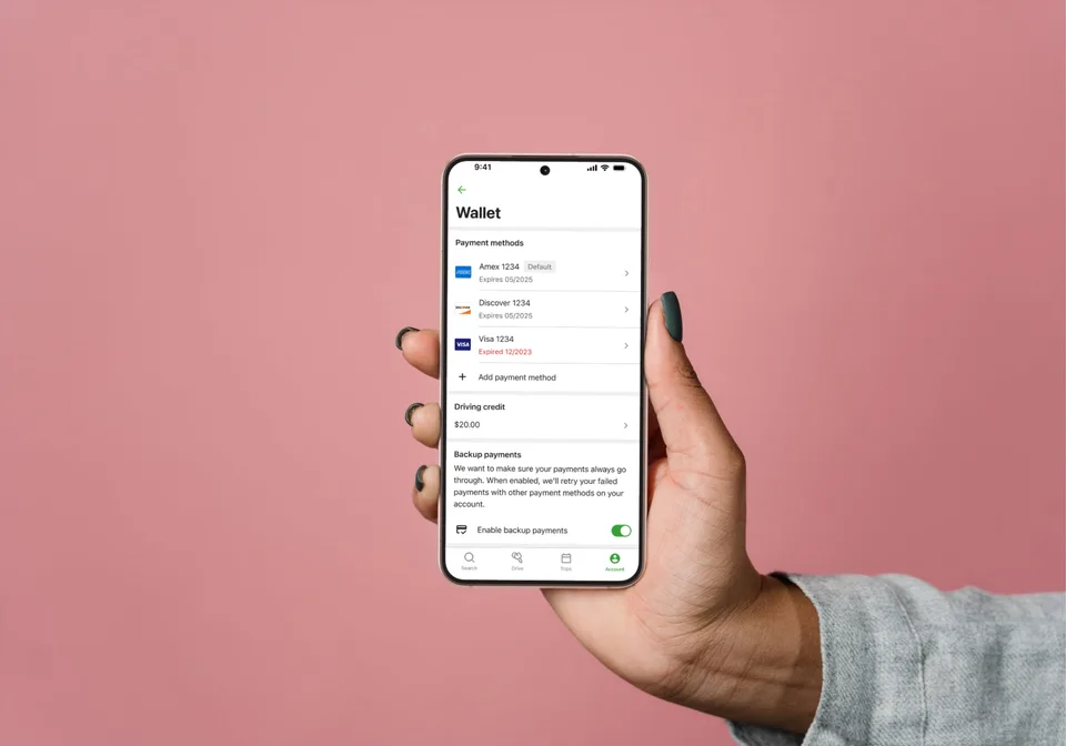
Zipcar
Make payment choice, backup charging, and recovery clear across app and web.
Zipcar
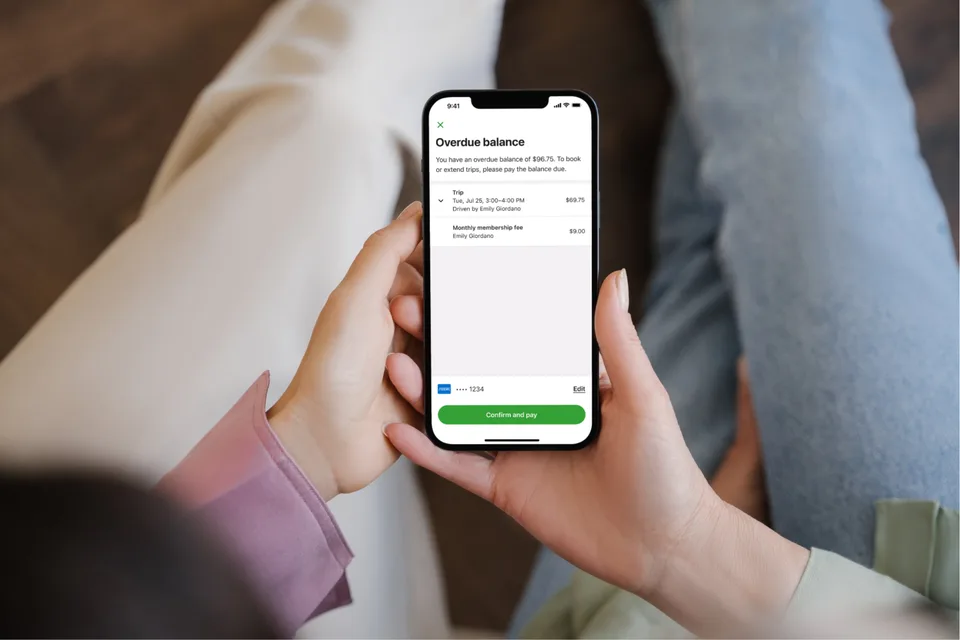
Help members resolve an overdue balance directly in the app.
MetLife
I helped build and maintain MetLife’s global design system for teams across more than 50 markets. My work covered reusable components, visual standards, documentation, and reviews with developers and QA, translating design guidance into things teams could use.
Shared components and guidance gave teams a consistent starting point across products, platforms, and markets.
After the team’s work with R/GA on the rebrand, I helped translate the recommendations into reusable components and practical guidance on Design.metlife.com.
A brief overview
I reviewed responsive components with developers and QA, checking the implementation against the rebrand’s standards. Those conversations connected design intent to the behavior and details people would actually use.
I documented component features, variations, and live HTML demos. Teams could inspect how a component worked and when to use it, rather than reconstruct intent from a static mockup. Documentation and handoff were part of the product.
First look
Expand details
I refined guidance for logos, typography, color, illustration, icons, and photography within the shared system. These standards gave product teams a common starting point while they worked on different platforms and market needs.
I helped align the icon library with the system’s visual standards. Consistent iconography made the foundation easier to reuse across products, rather than leaving teams to invent different symbols for the same idea.
A library has value only when teams can find, trust, and use it.
Clear guidance can prevent as much downstream rework as the component itself.
A global baseline should create coherence while allowing for platform and market differences.
Adobe · Generative AI
Create music that fits your scene with clear, editable generation controls.
Adobe · Generative AI
Turn visible action into editable layers of ambience and sound effects.
Zipcar
Help members report delays and recover when their car is late.
Zipcar
Introduce Zipcar’s first tiers for occasional and frequent drivers.
Zipcar
Make payment choice, backup charging, and recovery clear across app and web.
Zipcar
Help members resolve an overdue balance directly in the app.
MetLife
I helped build and maintain MetLife’s global design system for teams across more than 50 markets. My work covered reusable components, visual standards, documentation, and reviews with developers and QA, translating design guidance into things teams could use.
Shared components and guidance gave teams a consistent starting point across products, platforms, and markets.
After the team’s work with R/GA on the rebrand, I helped translate the recommendations into reusable components and practical guidance on Design.metlife.com.
A brief overview
I reviewed responsive components with developers and QA, checking the implementation against the rebrand’s standards. Those conversations connected design intent to the behavior and details people would actually use.
I documented component features, variations, and live HTML demos. Teams could inspect how a component worked and when to use it, rather than reconstruct intent from a static mockup. Documentation and handoff were part of the product.
First look
Expand details
I refined guidance for logos, typography, color, illustration, icons, and photography within the shared system. These standards gave product teams a common starting point while they worked on different platforms and market needs.
I helped align the icon library with the system’s visual standards. Consistent iconography made the foundation easier to reuse across products, rather than leaving teams to invent different symbols for the same idea.
How to collaborate and problem solve with Product teams
Proper Engineering handoff and if-then thinking for happy and unhappy paths
The importance of proper documentation in Figma
Adobe · Generative AI
Create music that fits your scene with clear, editable generation controls.
Adobe · Generative AI
Turn visible action into editable layers of ambience and sound effects.
Zipcar
Help members report delays and recover when their car is late.
Zipcar
Introduce Zipcar’s first tiers for occasional and frequent drivers.
Zipcar
Make payment choice, backup charging, and recovery clear across app and web.
Zipcar
Help members resolve an overdue balance directly in the app.